Couture Goes Minimal, and Celine Leads the Way
Hedi Slimane is making quite the entrance into the house of Celine. The Paris-based brand introduced a new logo via Instagram last weekend designed by the brand’s new creative director. The new logo is “directly inspired by the original, historical version that existed in the 1960’s,” according to the post on the brand’s official Instagram account. In doing so, they removed the notable accent on the first “E” in Celine. The actual font itself has changed just slightly, reducing the space between the letters as well as an increasing the size.
The old Celine logo (left) and the new Celine logo (right). Image: The Fashion Law
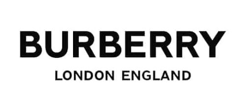
While this has been the talk of the town for the past few days, this isn’t the first time we’ve seen a rebrand like this. Just a month ago we saw the new Burberry monogram and logo by Riccardo Tisci that came on the heels of Tisci’s first show for the British brand, as well as Raf Simons’s new Calvin Klein logo. And it’s certainly not the first time we’ve seen this from Slimane, who famously dropped the Yves in Yves Saint Laurent back in 2012—a decision that caused a lot of backlash but ended up being a very smart move, because the brand’s popularity skyrocketed.
The new Burberry logo designed by Riccardo Tisci. Image: Burberry
So why the change? Well for one, all of these new logos have one thing in common: simplicity. Bold, black letters with tighter spacing make for a non-distracting logo. They're very clean but say a lot without having to say much, just like the people designing them.
The goal of almost every brand is to stay relevant and stand out. These days we get bored very easily, and companies have had a hard time keeping up. A rebrand like the ones at Celine, Calvin Klein, and Burberry are exactly that: attempts at staying cool. Though we may have an attachment to the accent on the “E,” for example, this slight change not only gave the brand tons of press but also made room for someone new to take the helm. Coming into this famous house after Phoebe Philo, a woman who has been shaping Celine for the past decade, Slimane probably feels like he needs to make it his own.
New Calvin Klein logo designed by Raf Simons. Image: Calvin Klein
The idea behind these branding strategies, according to Raf Simons, is to use "a more uniform logo so the brand can more easily adapt to changing times." My question is, with all of these similar-looking brand logos, at what point do they start to blend together and confuse the average consumer? The logo is the identifier of the brand, something you can look at and immediately recognize. By stripping all uniqueness from the logo, you start to lose that.
Fashion has become the survival of the fittest, and maybe these simple logos are the best way to adapt. Only time will tell, but in the next few years, I have a feeling that we’ll be seeing a lot more than just a dropped accent mark.


